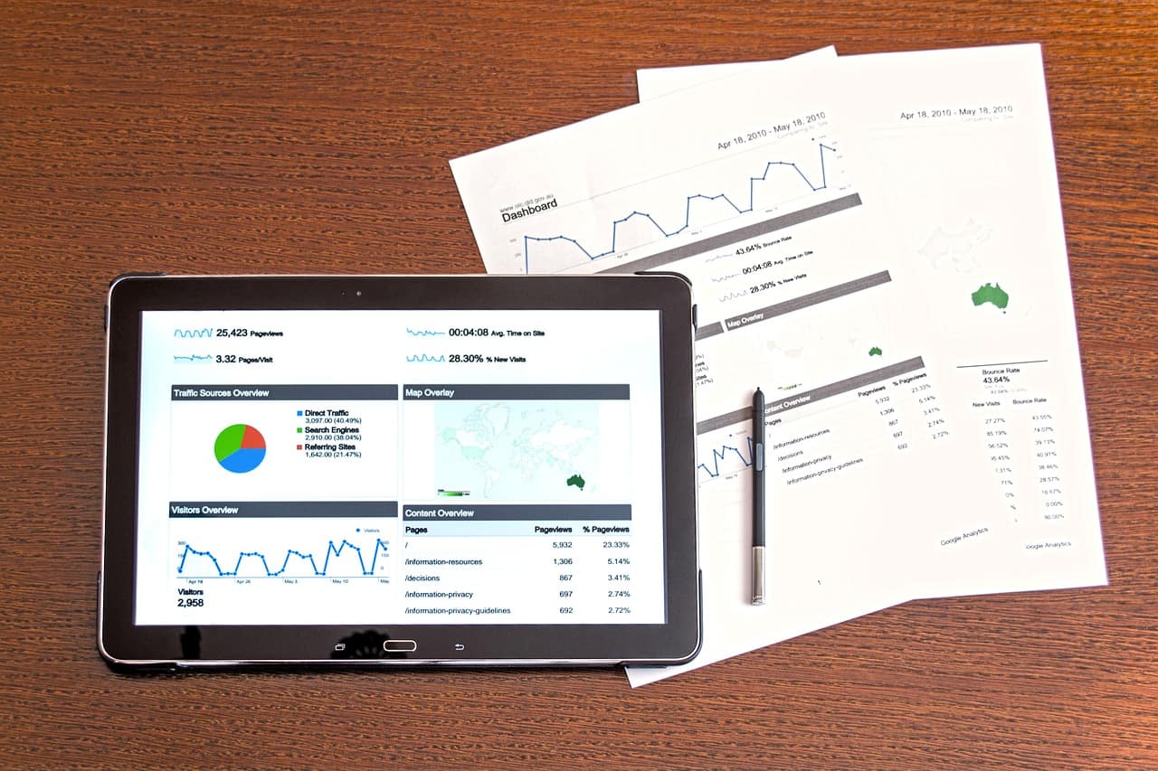
If you’ve got people already coming to your website but not getting the number of leads/sales you need, you’ve good a couple of options.
- Go find some more traffic
- Optimise your website to convert better
Traffic can be pretty expensive. Increasing conversions can be very cheap. That makes the latter a great place to start. As an added bonus, when you do go get more traffic later you’ll convert more of them. Double whammy.
There are a few quick easy things you can do to help convert visitors.
1. The 3 Second Rule
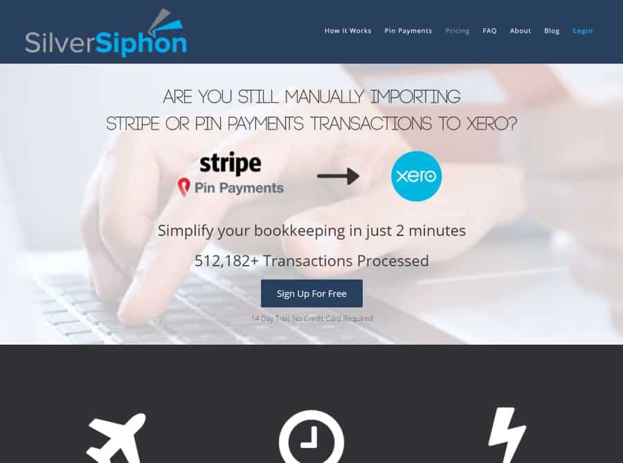
When someone lands on your website, you’ve got 3 seconds to leave a good impression.
The first thing will be the header, so make sure this area communicates quickly and effectively how you improve your clients life.
There should be:
- Your unique selling proposition which is short, sharp and to the point
- Great design to instill confidence
- An image which shows the end result of your client using your company
- Something to get the visitor to continue reading
To get them to continue reading, you might have a button which promts them to click, scroll down and continue reading. Another option is to have the first part of the content right underneath your header only just visible, so that it is cut off by the bottom of the browser. This creates a psychological want to scroll down to see what is covered up.

2. Testimonials
Testimonials add a level of social proof to your website – one of Robert Cialdini’s Principles of Influence.
There is a right and wrong way to do testimonials. The wrong way is to slap them all on one page, or in a rotating banner on your home page.
The thing is, nobody cares that much. They don’t want to spend the time reading through pages of testimonials.
Instead, sprinkle testimonials throughout your site. Choose the ones that are most relevant to that particular service or product. Generic testimonials suck. Place them within the actual content. Not off in a sidebar that no one looks at. Put them right there in the main body of the content.

Make them stand out and have all the necessary information.
- Name
- Image
- Company and position (if applicable)
- URL (we don’t add the actual link though)
3. Establish Authority and Trust
Another of Cialdini’s Principles, authority shows your client that you mean business and know what you are talking about. Spend some time thinking of anything impressive you or your business have done which demonstrates your ability and trustworthiness.
Some examples might be:
- Major clients that you have worked with
- Accreditations or awards
- Associations or memberships that are relevant
- Real life images of your team or product in action
- Images of your team with prominent industry personalities
- Research and development that you have been involved with
A side note for online businesses: Even though you do all your dealings online, it can help to have a phone number and physical address in the footer. This legitimises your business as a bit more real, for those people that might need that to feel comfortable. Very few people will likely call, but the difference in trust value can be enormous.
4. Personality
Personal connections are getting more and more important as people get sick of being just another number as a client for large businesses.
Yeah, it is hard to develop a real connection by someone just reading your website, but you can do a few things that show you are real people with actual feelings and lives.
Not everything has to be super serious in business. If you like to have a a bit of fun while you work (I hope you do), let that come through in your copy. In some industries, a level of professionalism might be expected, but you can still open up a bit in certain places on your website.

The best place for this is your About page – typically the second most popular page of a website. People want to know who you are.
Here’s some examples:
- Team photos that aren’t boring corporate shots – maybe from a home envorinment or pulling a face when you mouse over them
- Unexpeted lines that get a laugh. On our contact page we ask people to swear first to get it out of the way
- Real images of the office or team at work, having fun
- As above but with video
- Stories. People love stories. Write about how you got started and why/how you’re making a difference (or make a video of it)
5. One clear Call to Action on every page
It blows my mind how ofter I scroll to the bottom of someone’s website and am greeted with an empty footer that doesn’t tell me where to go next. I’ll scroll back up the menu and dig through the different options until I find something that sounds like it might be what I want.
Wouldn’t it be nicer if you just told me what to do next right there are the bottom of the page?
On each page, think about what one thing you want the visitor to do next to bring them closer to a sale. Is it to call you? Fill out a contact form? Drop in their email address?
Also take a look at how many things you are asking people to do on any one page. Are you asking them to call you, opt in to a newsletter, get a freebie by putting in their email and fill out a contact form on the sidebar all at the same time?
Don’t do that. Try to make it really obvious what the next action is for the visitor. This often means removing parts of your website and simplifying it.
More is not better.

Now go and do it
These things aren’t difficult – you just have to think about how you can apply each one to your website. Take some time out with a pen and paper an brainstorm some things for each section. Then get your tech guy to make the changes.
A killer headline and header image could increase your conversion rate by 50%. If you find that out in 6 months, you’ll kick yourself that you didn’t do it sooner.
To sooner the better. Make a basic change and let me know how it goes for you in the comments.

